AHF Pharmacy
Updating the website design with modern design principles to improve usability and branding.
Branding • Visual Design • Research • UX/UI
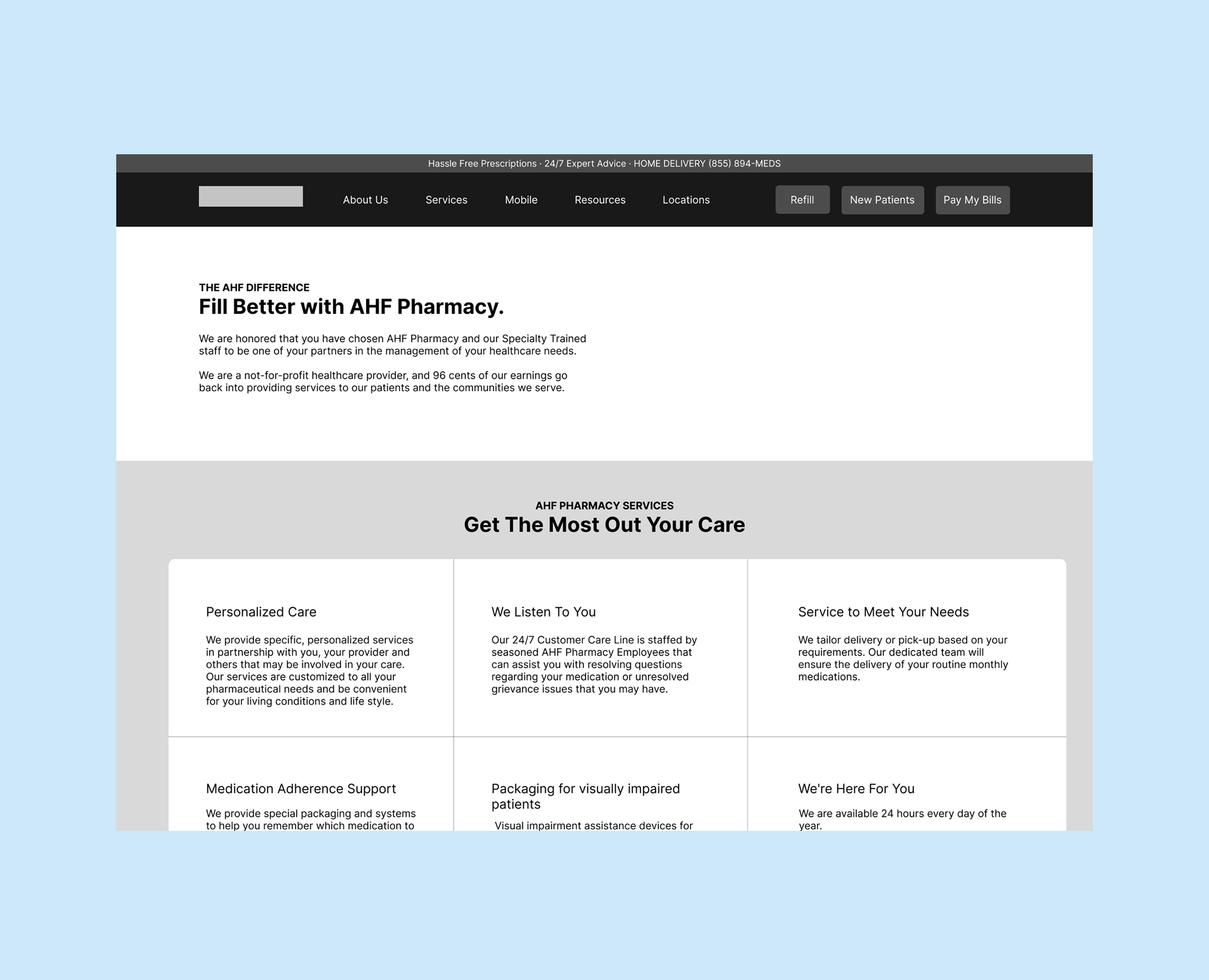
A major problem with the initial website was that it was outdated in design, had inconsistent branding with the overall AHF image, and faced usability issues across the website. I had to work with major stakeholders who have worked on the pharmacy branding from the beginning, so getting their buy-in was very important for the project's success.
Deliverables
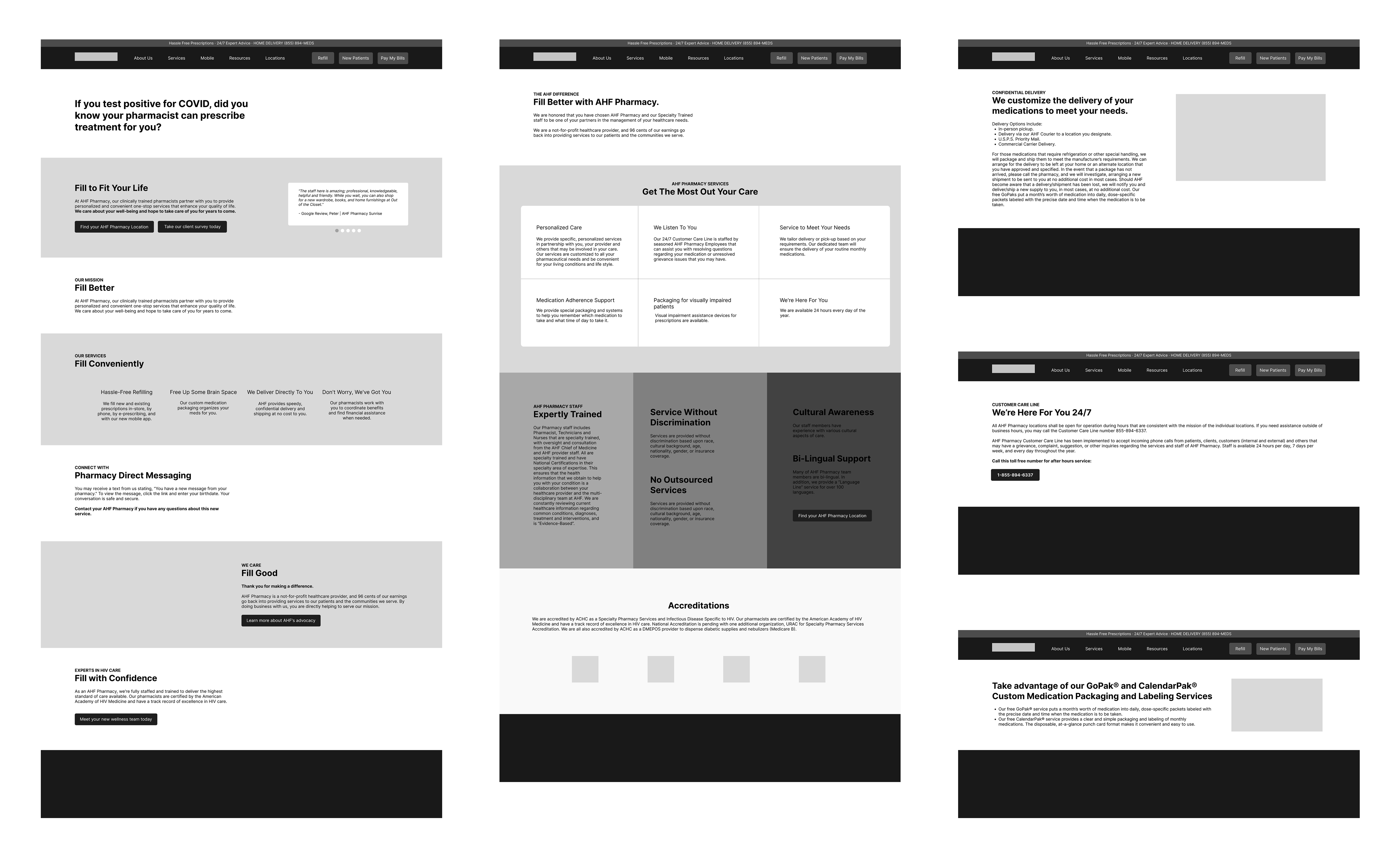
User Research • Wireframes • Mockups • Testing • Iterations
To better understand AHF Pharmacy's users and their needs, I conducted surveys and usability tests, and reviewed analytics to gain a deeper understanding. I learned that clients found it challenging when trying to learn more about different services, how to pay their bills, and where to go if they're new patients. This gave me the direction to focus on improving navigation, overall accessibility, and prescription management, while modernizing the web experience to align with company goals.
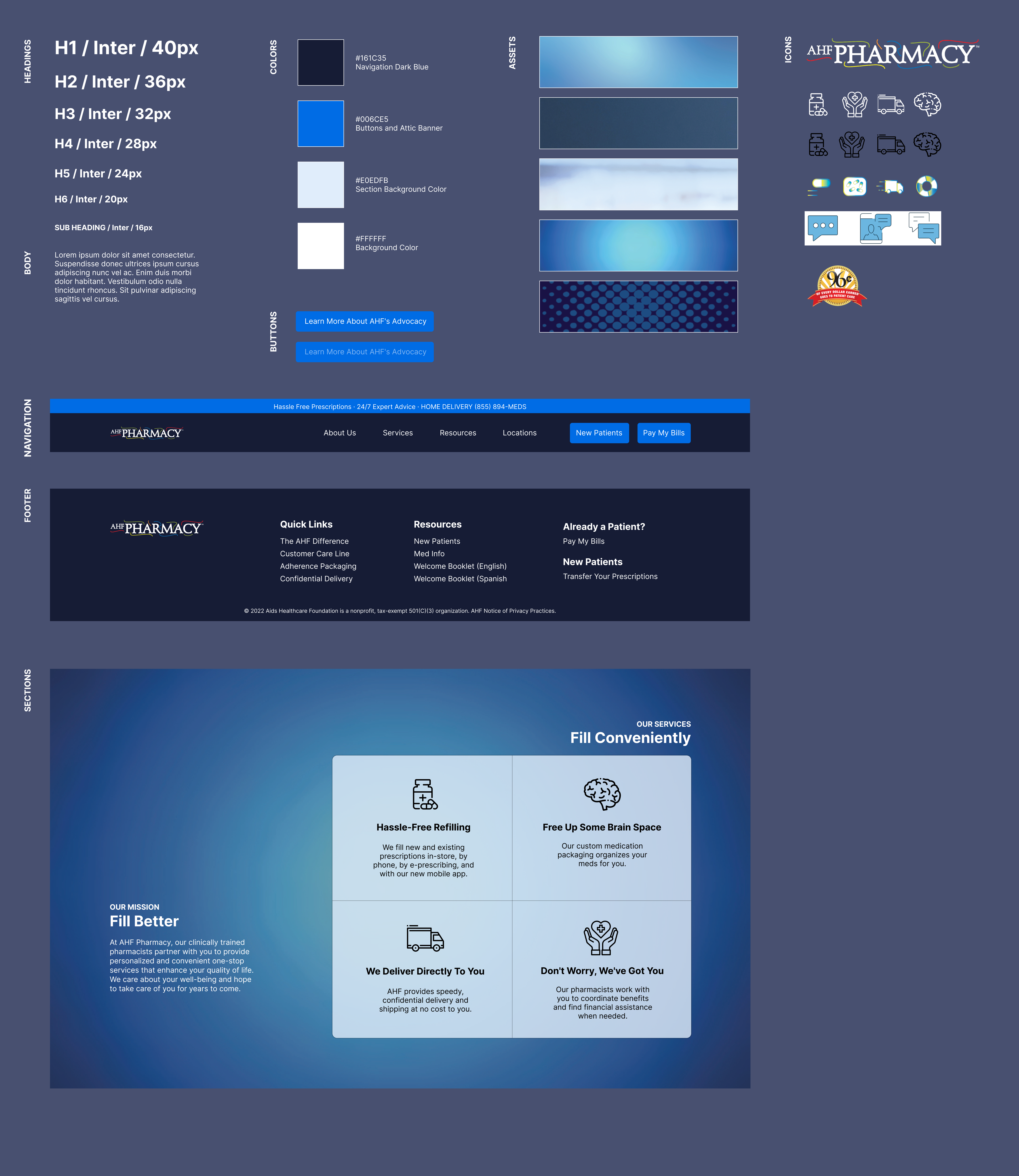
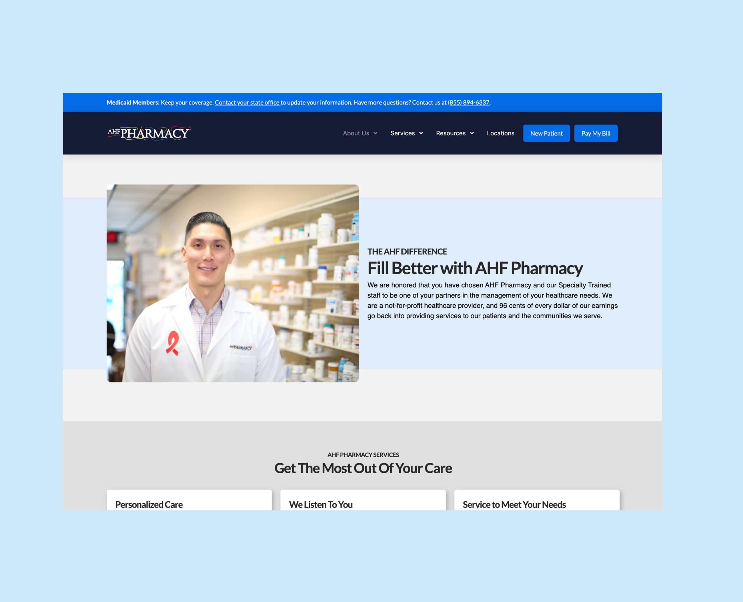
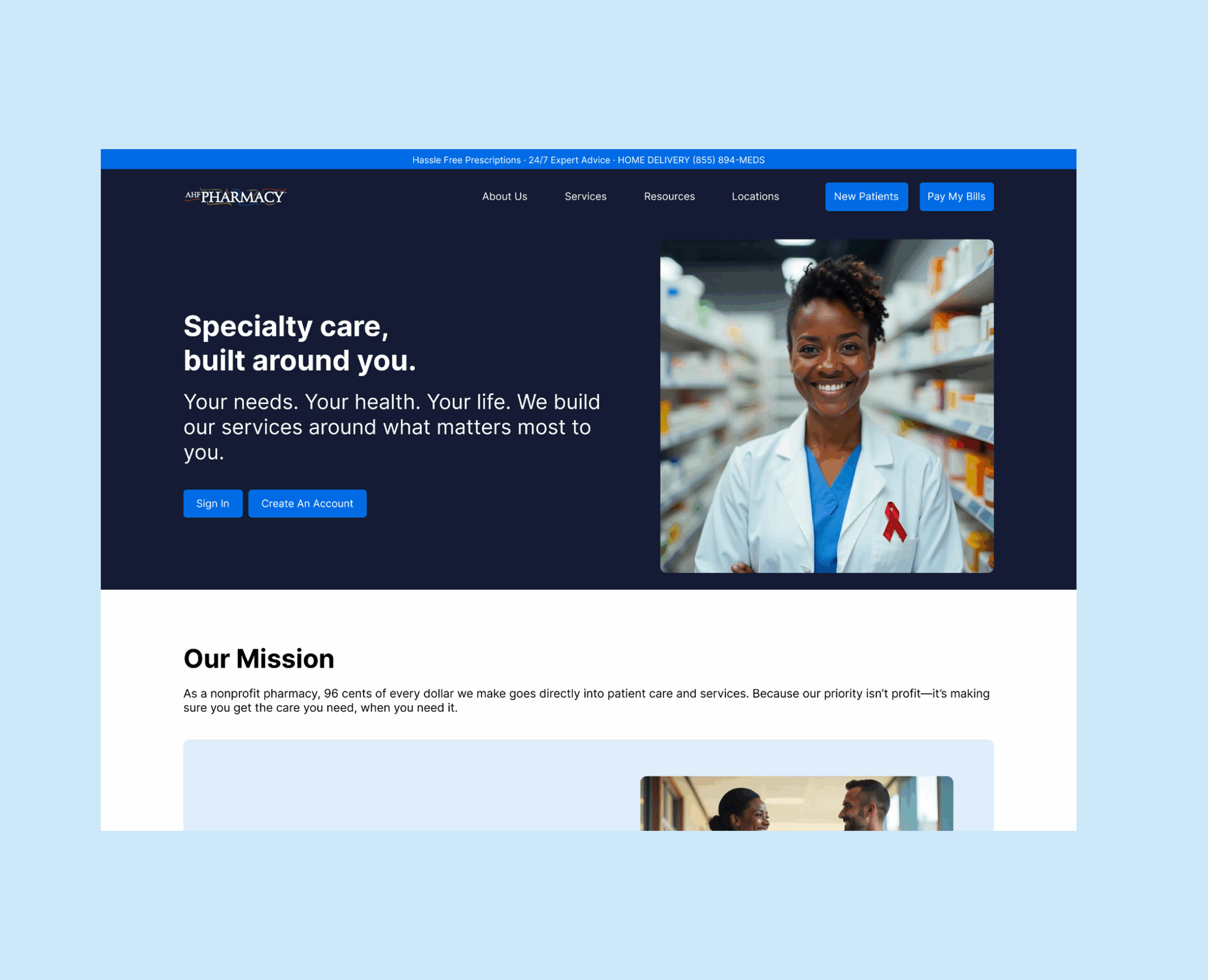
I conducted a competitive analysis across competitors' websites to see where we rank based on ease of use, updated design principles, and functionality. This helped me identify key areas the new website should focus on and feature. While working with the creative design and branding teams, we established a style guide to help align print and digital material while maintaining the brand identity for future deliverables. The style guide helped guide the wireframes to mockups.
As mentioned previously, there were several stakeholders who needed to be on board with the new design direction. I conducted educational workshops, wireframe walkthroughs, and iterative feedback sessions to make sure each stakeholder was on the same page as the team, while addressing friction on the spot.
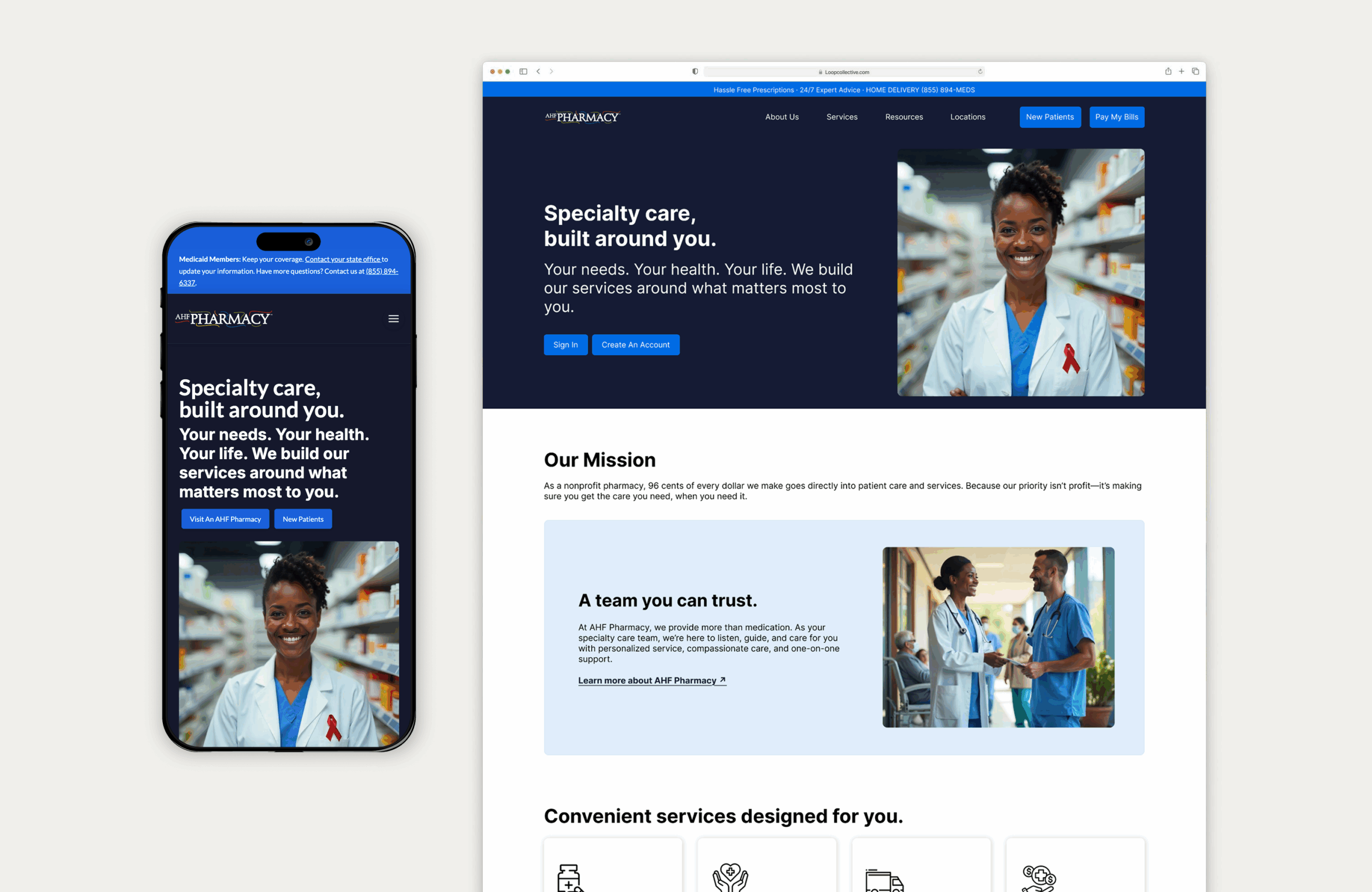
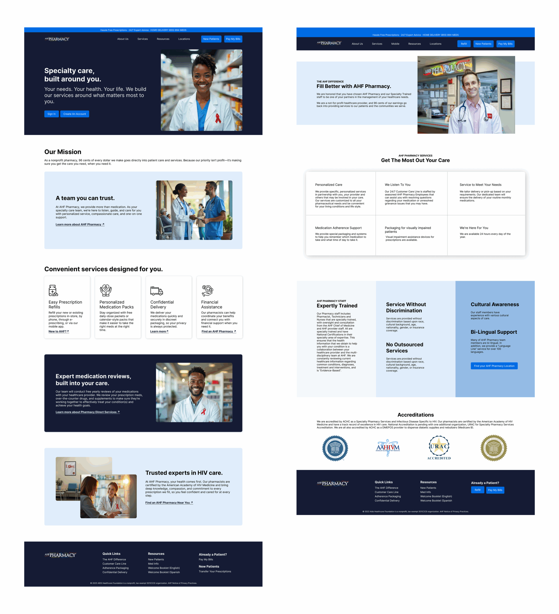
Outcome
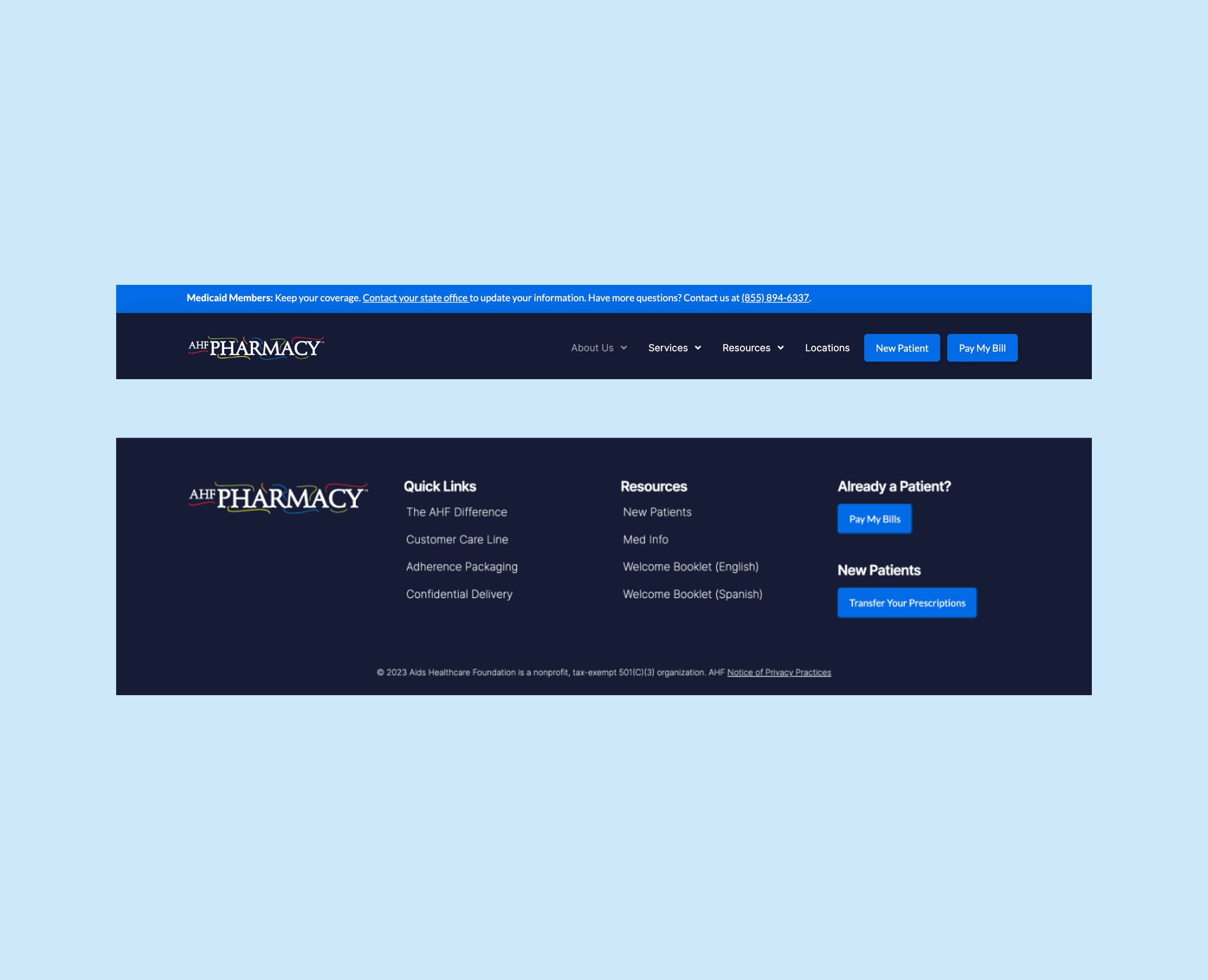
Once all stakeholders were on the same page, we were able to launch a new website that featured custom imagery to align users with the brand, updated the navigation while including a space for announcements, and streamlined the footer space to house essential links to improve the user flow. The new website design showed a decreased bounce rate, smoother user flow with little to no friction during usability testing, and there was an increase in clicks on the locations page.