New York Health Provider
UX/UI • Branding • Stakeholder Education • User Research
ACQC has grown to become the largest provider of HIV/AIDS services in Queens, New York, and has come to AHF to help redesign their website to better align with their audience with an updated design. The original website had an overwhelming amount of text, lacked a human connection, had weak visual hierarchy, and had an outdated design.
Deliverables
User Research • Wireframes • Mockups
With the observations in mind, it was clear the direction to take the design strategy. However, it's important to factor in who the audience is and who ACQC would like to speak to. Through several meetings with their team and reviewing their website insights, I was able to identify the main demographic to reach and resonate with, including those from the LGBTQIA+, affordable housing, teens and young adults, and other communities. This helped me identify the best imagery to use for the website, as well as the tone of the website when working with the copywriting team.
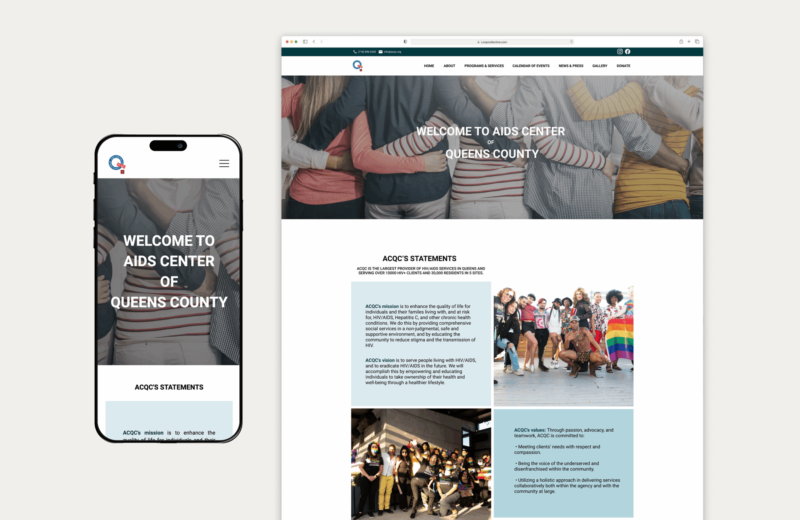
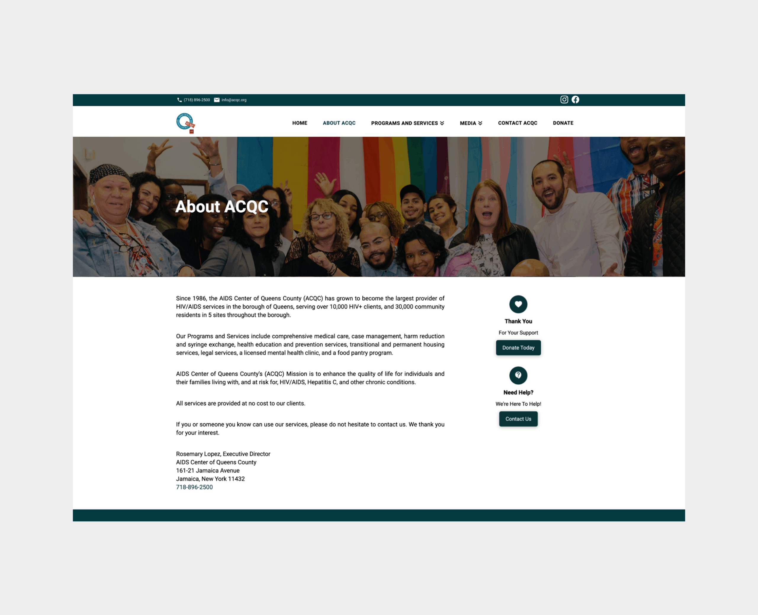
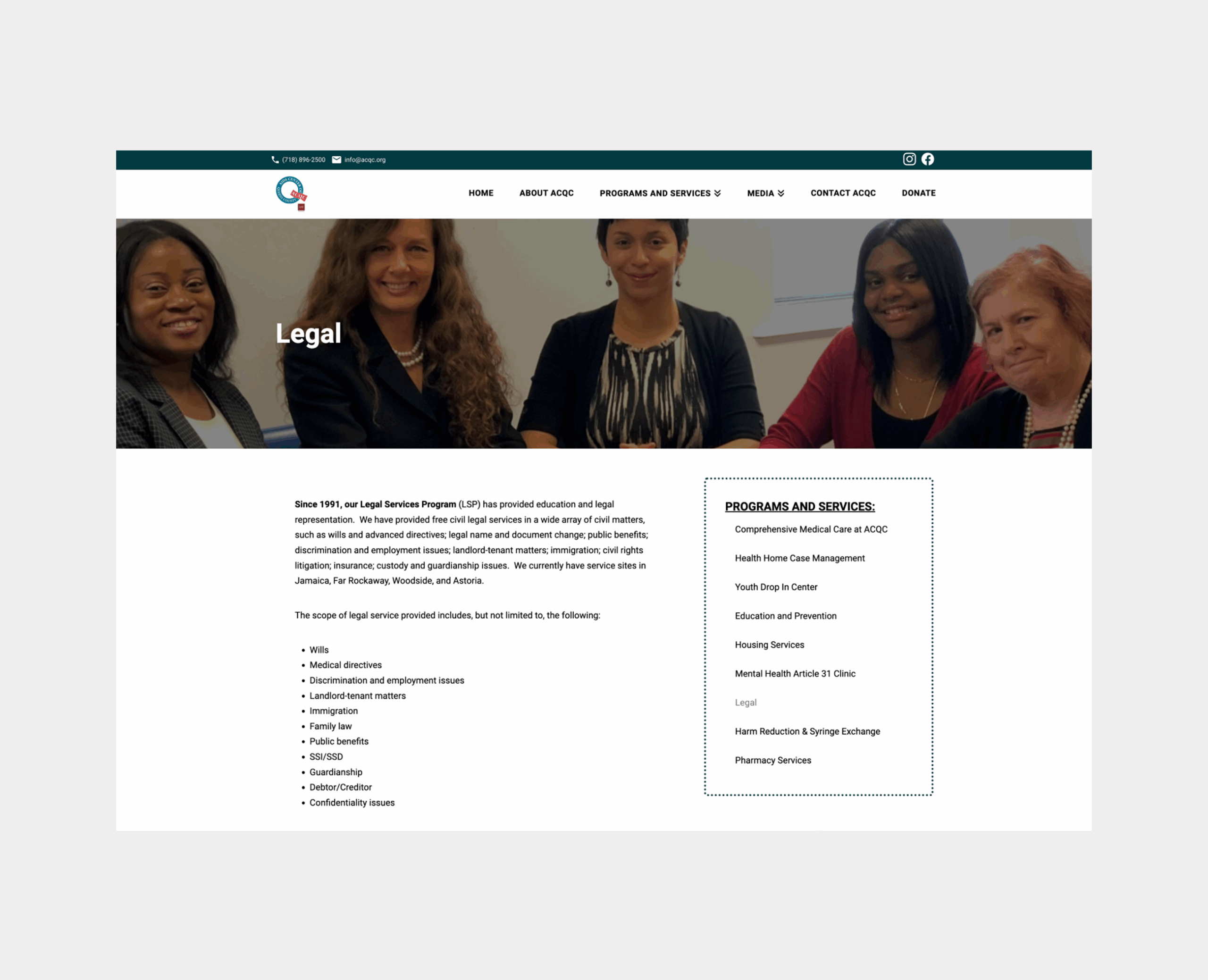
In the mockups, I decided to utilize more white space to make it easier for users to read through information and improve the visual hierarchy. To create a more human-centric focus on the website, I focused on combining whitespace with more imagery to reinforce ACQC’s values of inclusion, advocacy, and compassion. These attributes were then applied to the rest of their website to create a more welcoming, friendly website that speaks to their audiences.

Outcome
In the end, we launched a transformed website that shifted from a text-heavy, dated layout to a more engaging and people-centered experience that better reflected the organization’s mission. The redesign offered clearer navigation and stronger calls-to-action, making it easier for users to find information and ultimately encouraging more donations and engagement.