Healthy Housing Foundation
Iterating homepage design while addressing accessibility and usability issues.
UX/UI • Accessibility • WCAG Compliance
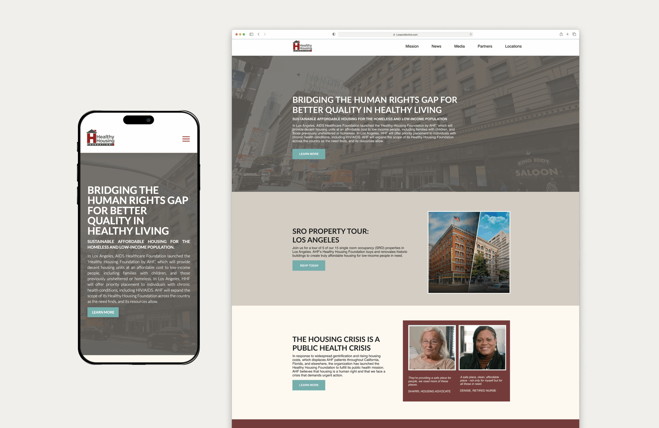
A few problems on this website were that it showed several WCAG errors when conducting an audit, including contrast errors, broken videos, and empty links. When working on this, I collaborated with stakeholders, including the housing, creative design, copywriting, and marketing teams.
Deliverables
Accessibility Audit • Wireframes • Mockups
Through accessibility audits and working with the housing team, we learned that the current website was missing key features and information to help users find what they're looking for. This helped me guide my conversations with our copywriting team to ensure that the correct information was communicated in the new homepage redesign, while addressing other key accessibility errors in the design itself. When working on the design, I collaborated with both the creative design and marketing teams to curate a style guide that included a color palette and typography guide.
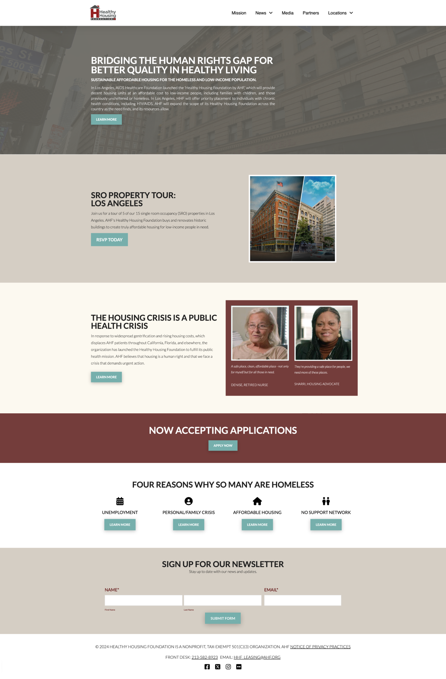
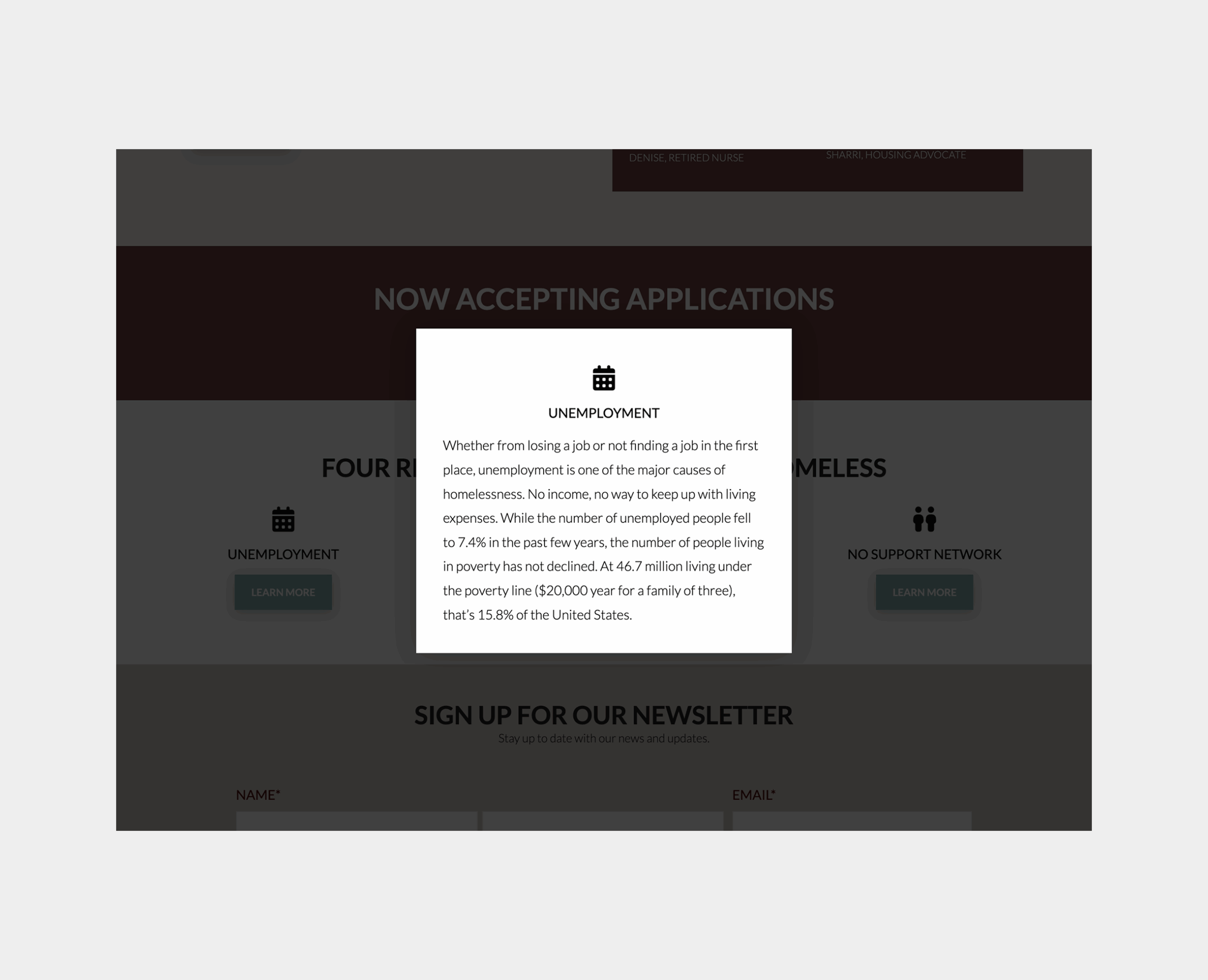
Months later, we saw that live users weren't engaging with specific content on the homepage. This led me to run tests and review the results, seeing that users did not engage with the "4 Reasons Why So Many Are Homeless," and oftentimes skimmed through that section. Through these tests, users struggled with locating the information in a timely manner. This led to the iteration of the section to get transitioned into buttons with pop-ups as opposed to showing the users all the information upfront.
Through the second round of iterations, the team wanted to further address the contrast on the website to improve accessibility. This led us to combine the style guide with our accessibility findings to move forward with flat backgrounds that made it easier for users to read.


As time progressed, we were able to work on more pages on the website, including the locations pages. The original location pages featured all the basic information, but lacked unity and imagery. In the new design, we wanted to feature more images of the properties, include more information, and ensure that the basic, necessary information would be available on the website.
Outcome
After launching the first version of the homepage redesign, we continuously iterated on it depending on shifting priorities. Through the different iterations, we were able to create a more accessible, user-friendly website to help those seeking more information about our affordable housing options.