Health Clinics
Addressing usability issues, inconsistent design, and a confusing user journey.

User Research • Competitve Anlaysis • Stakeholder Education • UX/UI
A few problems on this website were that it failed to offer a streamlined user experience when a user navigated through the website, and the design was inconsistent throughout the website. Additionally, leadership teams wanted the website to resonate more with specific demographics of users, which the website lacked. This project required a deep dive into who the users are, how we can resonate with them, and how we can streamline the website experience to better address their needs.
Deliverables
User Research • Wireframes • Mockups • Testing • Post-Launch Iterations
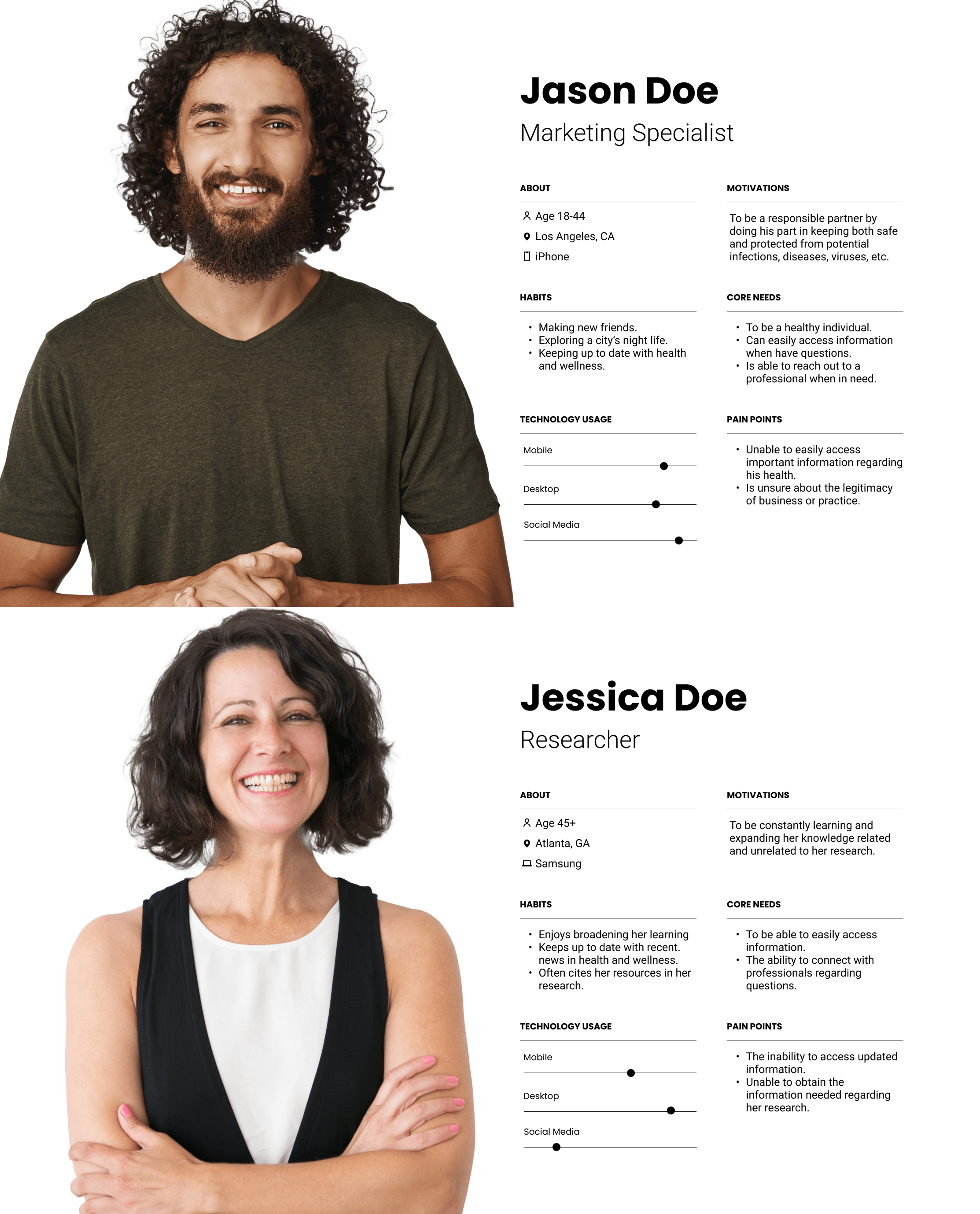
Through usability tests, I learned that users struggled with locating key information on specific pages, facing a convoluted user journey. This highlighted the confusion in the navigation system and needed to be restructured. Additionally, I met with stakeholders and data teams to better understand who are users are to construct dedicated user personas to lead the redesign strategy. These personas represent different genders and age groups, ensuring we are addressing the different needs of our users.
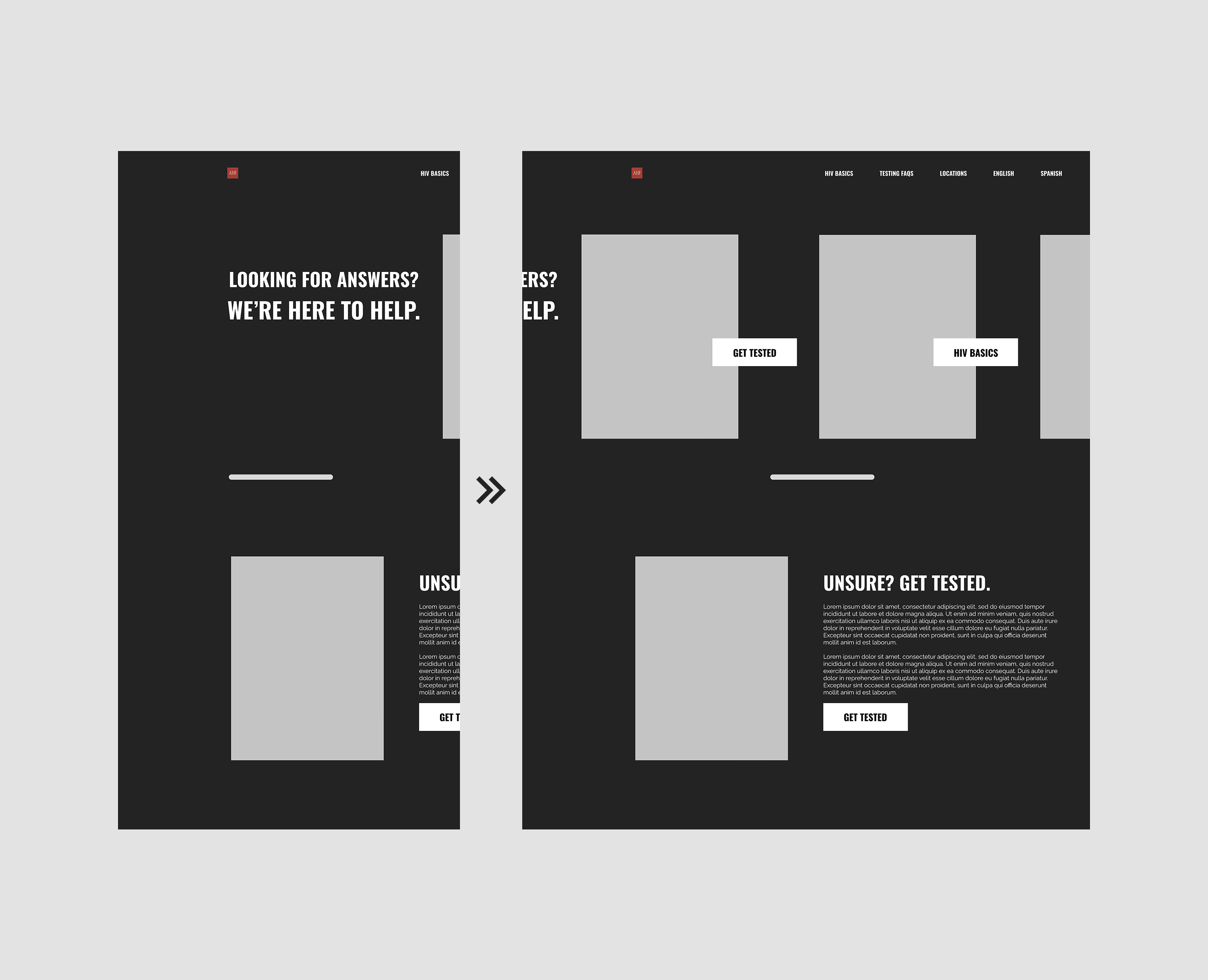


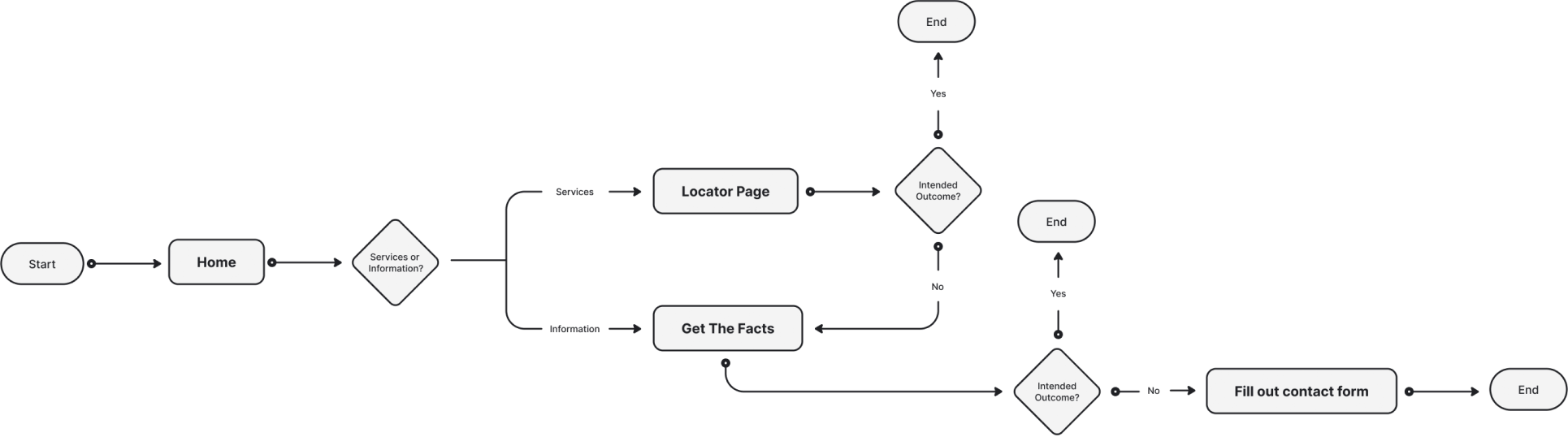
After reviewing the usability test results, I restructured the navigation system, removed the footer, and eliminated unnecessary pages to limit the user from navigating between pages, to decrease confusion. This led me to redefine the user flow to help users find what they are looking for in a shorter number of steps. Through further usability testing, users showed to have less friction when completing tasks around the navigation and content hierarchy, further validating that the new layout helped streamline user goals.
Outcome
After launching the new design, there was an unexpected turn in events when the live traffic revealed conflicting results from our usability tests. We noticed there was a decline in specific page visits or events (button clicks), and the bounce rate increased with a drop-off rate at the homepage. It was revealed that while testers were able to successfully complete tasks, real users were struggling with the new design. I learned that live users did not recognize that the above-the-fold content featured a slider with CTAs. I quickly restructured the homepage layout to feature all CTAs instead of nesting them in the slider. After monitoring the live traffic for a few weeks, we saw the metrics improve and soon surpassed the initial website metrics, including a reduced bounce rate and an increase in visits to the locations page.