AIDS Healthcare Foundation
Concept validation through user testing and research analysis.

User Research • Competitve Anlaysis • Stakeholder Education • UX/UI
The website faced several usability problems, including difficult navigation throughout the single-page website, an outdated design that did not match the rest of the organization's digital properties, and confusion among users differentiating this website from the main organization's website (www.aidshealth.org). This project required a deep understanding of the website's purpose, concept exploration in design, and educating stakeholders on testing and research.
Deliverables
User Research • Wireframes • Mockups • Usability Testing • Research Analysis
I first sought out stakeholders to better understand the purpose of the website. By working with leadership, I learned that the main objective of this website was to direct users quickly to our other websites depending on their needs. During these stakeholder meetings, I noted the different priorities some had in regards for the new design, including adding logos, imagery, and information for context.
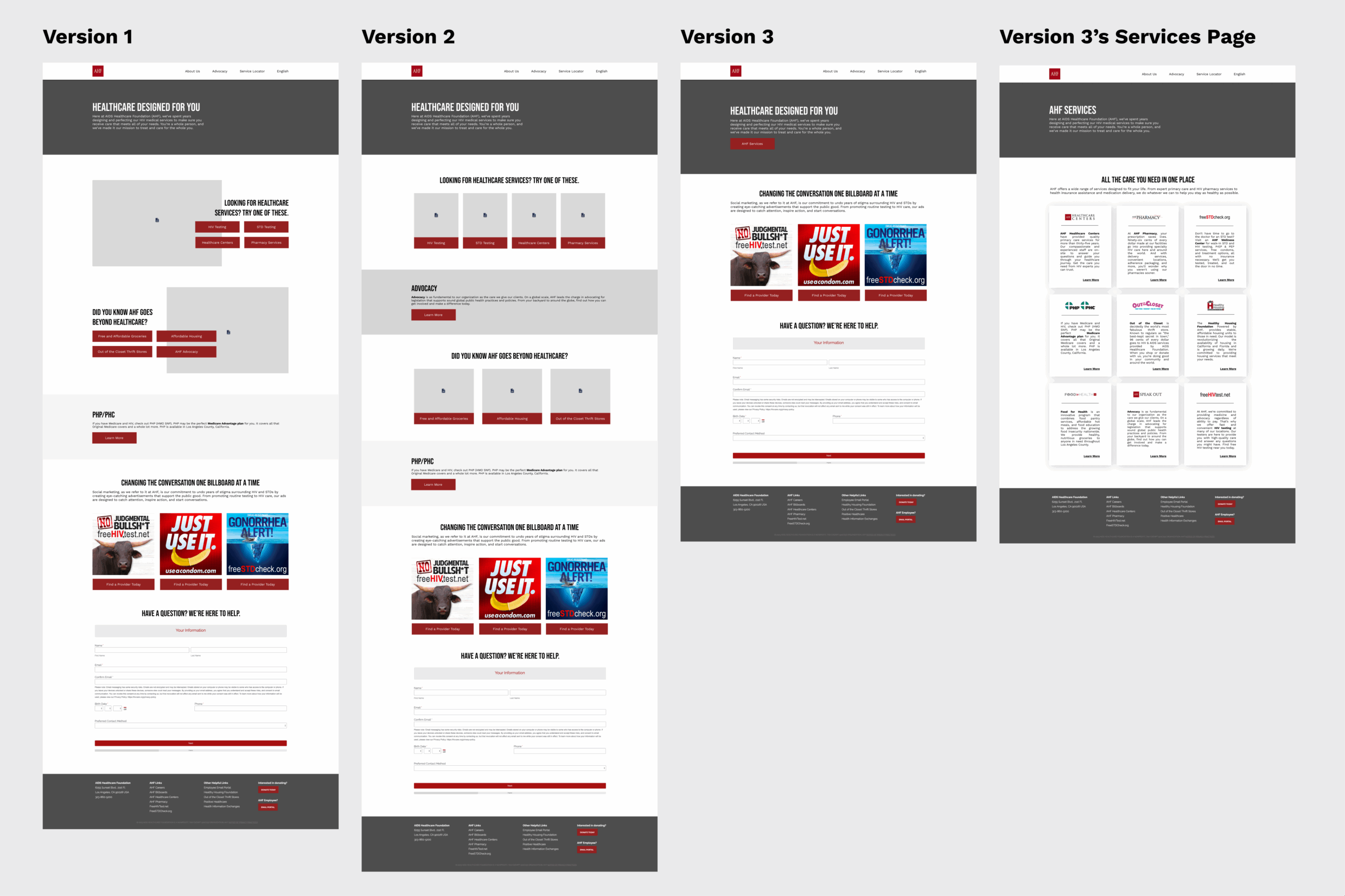
This led to several wireframes and mockups to test which layout users would respond best to and show the highest ease of use when navigating through specific tasks. We explored layouts that featured stakeholder priorities (imagery and logos), while experimenting with different layouts to explore different design elements that were more up-to-date.
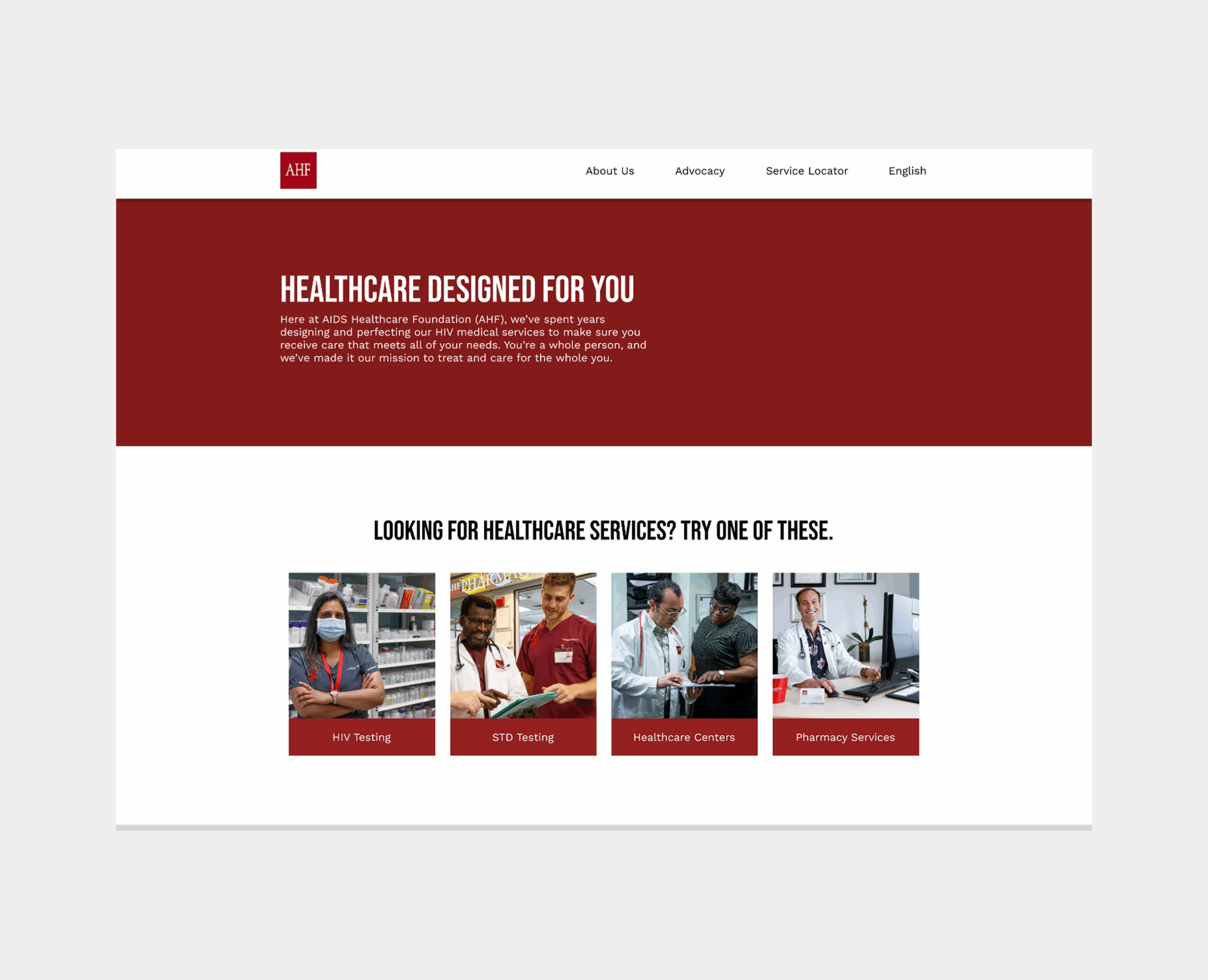
Version 1: New layout that slightly differed from other digital properties, but still retained most of the branding.
Version 2: Imagery-heavy, featured some contextual copy, but little.
Version 3: Logo-centric, more contextual copy, and a minimal homepage that redirects to the services page.
Through running over 80 usability tests, we learned that Version 1 was the clear winner with Version 2 as the runner-up. Versions 3.1 and 3.2 did very poorly. Below are some insights from the tests:
- In Version 1, nearly all users passed each task, expressed positive sentiments on organization, layout, and overall experience, and left the test with a positive impression of the organization.
- 100% of testers indicated they were able to locate the information requested of them.
- 93% of testers indicated they understood the purpose of the website (7% indicated "Neutral").
- 87% of testers indicated that the experience changed their impression of the organization in a positive way (13% indicated it did not change at all).
- In Version 2, most users passed each task, despite experiencing some confusion. Users had a strong positive sentiment of their experience and left the test with a positive impression of the organization.
- 100% of testers indicated they were able to locate the information requested of them.
- 89% of testers indicated they understood the purpose of the website (11% indicated "Neutral").
- 80% of testers indicated that the experience changed their impression of the organization in a positive way (20% indicated it did not change at all).
- In both versions of Version 3, most users did not pass each task, experienced the most confusion and frustration, were overwhelmed by the Services page, held the most negative sentiments, and left the test having a neutral to negative impression of the organization.
- 41% of testers indicated they weren't able to locate the information requested of them.
- 27% of testers indicated they didn't understand the purpose of the website.
- 20% of testers indicated that the experience changed their impression of the organization in a negative way.


After running the usability tests, I shared the findings with stakeholders. This led to objections in moving forward with the best-performing concept due to a conflict in stakeholder priorities. Moving forward with the high-performing concept would mean we would be opting to remove logos, contextual copy, and use limited imagery on the website. However, our main objective is to align both business objectives and user goals by ensuring users know how to get more information based on different needs. By putting together our research findings, statistics, and competitive analysis findings, I was able to provide more context through educational workshops and thorough walkthroughs in research efforts, including usability test findings, data analytics, and resources on UX design principles.
Outcome
Once all stakeholders were informed, everyone felt comfortable moving forward with the concept. This led to the successful development and launch of the website, reducing bounce rate, time on page, and increasing usage of website usage.