AHF
Reimagining the homepage to clarify user intent, elevate global representation, and enable scalable collaboration.
Strategy • UX/UI • Information Architecture • Accessibility
A major challenge with the initial homepage was that it was outdated in both design and user focus. The experience was largely geared toward public relations and press audiences rather than the everyday users seeking healthcare, housing, food access, advocacy, or global program information. In addition, page speed and accessibility issues negatively impacted performance scores and overall usability.
Leadership requested a refreshed design that better represented the organization’s major business lines, while the product team aimed to improve user intent mapping, conversions, and performance metrics. I led the strategy and design of the homepage redesign, working hands-on in Figma while aligning executive leadership, global teams, public health, marketing, and product stakeholders.
Deliverables
User Research • Analytics Review • Wireframes • Mockups • Usability Testing • Accessibility Audits • Component Library
To better understand how users interacted with the homepage, I conducted analytics reviews, surveys, interviews, usability testing, and accessibility audits.
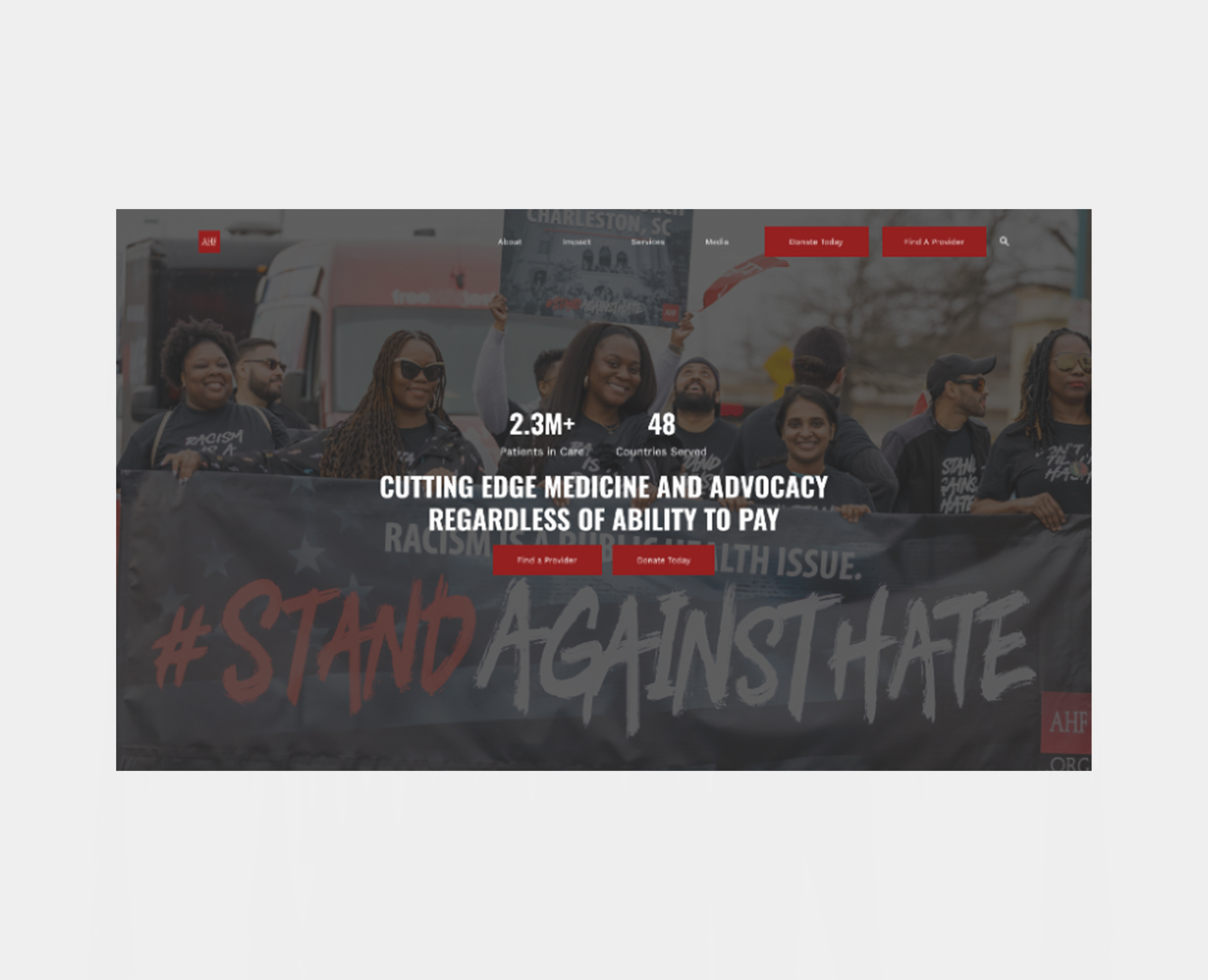
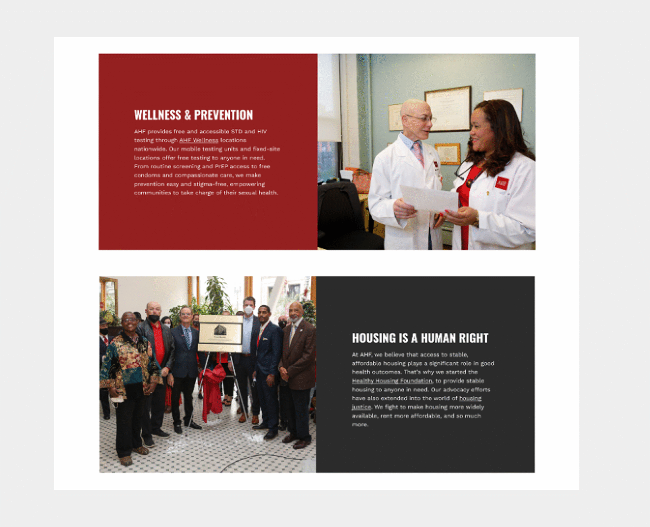
The research revealed that the previous layout created confusion around the organization’s scope of services. While AHF operates across healthcare, wellness, affordable housing, food access, advocacy, global initiatives, and public relations, the homepage did not clearly guide users toward these distinct pathways. Navigation lacked clarity, messaging hierarchy was inconsistent, and the experience did not reflect the organization’s global presence.
These insights shaped a strategy focused on improving information architecture, clarifying calls to action, strengthening global representation, and modernizing the visual experience while maintaining brand integrity.
To support scalability across a large, decentralized web ecosystem, I developed a modular component library grounded in an updated visual system. This included reusable section templates, header variations, standardized content blocks, and structured layout patterns. The framework enables smoother collaboration and handoffs between design, development, marketing, public health, and global teams, and serves as a foundation for phased adoption across additional pages.
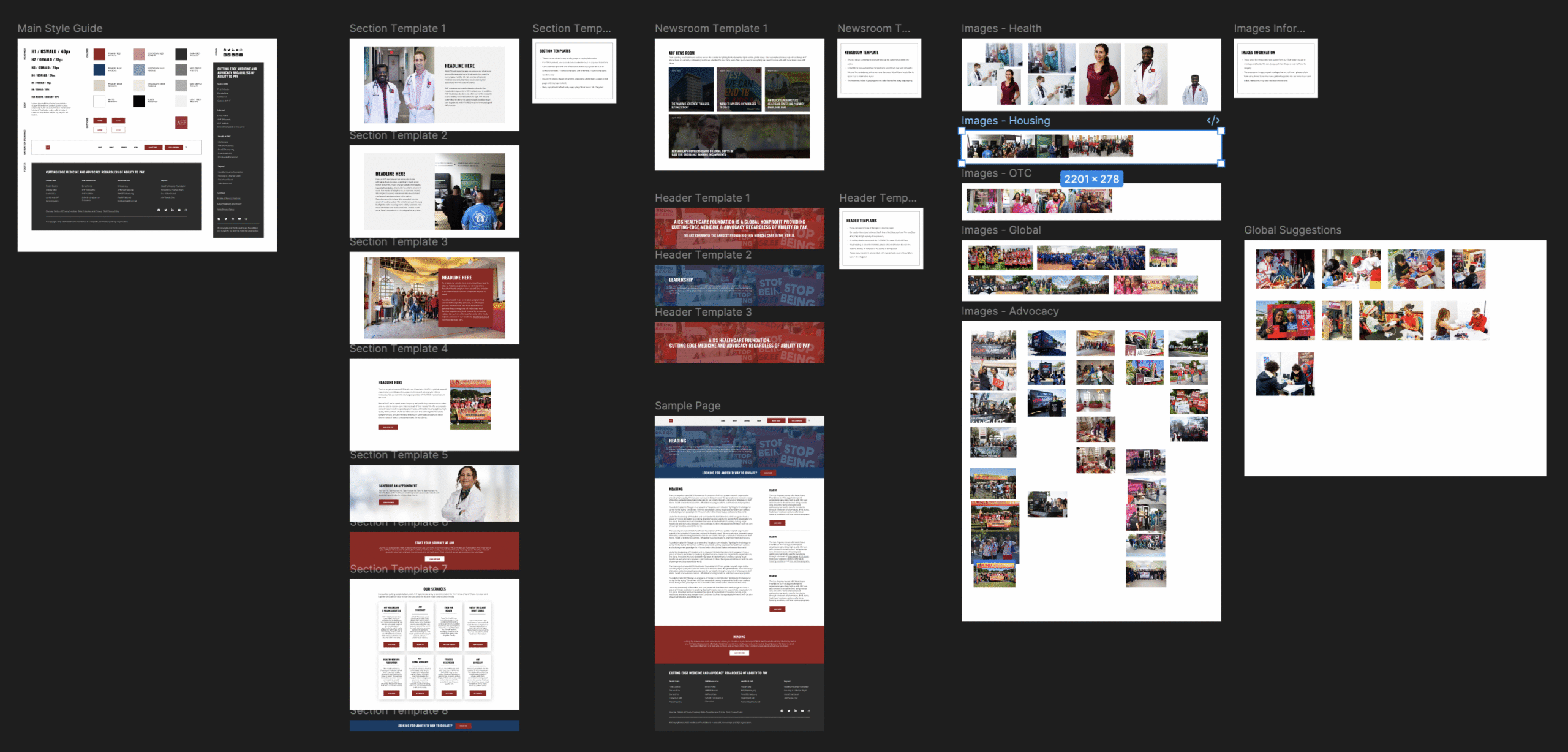
Design decisions included introducing a more impactful header with clearer primary calls to action, restructuring navigation to better reflect major service areas, implementing a stronger messaging hierarchy supported by updated photography, and prioritizing accessibility improvements. Post-launch Google PageSpeed Insights scores reflected measurable gains, with accessibility improving from 78 to 95 and performance increasing from 31 to 55, despite technical limitations within the legacy site structure.

Outcome
The redesigned homepage provides a clearer representation of the organization’s core business lines and strengthens alignment between user intent and homepage pathways. Usability testing showed smoother user flow with reduced confusion around service categories and entry points.
Beyond visual improvements, the modular component framework established a scalable direction for future updates across the broader site. The redesign improved accessibility scores, strengthened performance metrics, and created a more cohesive, globally representative digital presence.