Healthcare Centers
Unifying the fragmented user experience and strategizing content organization.
Branding • Visual Design • Research • UX/UI
The problem at hand was the fragmented patient experience in-person and online - there was a disconnect between print materials/signage at our healthcare centers and our website experience. Patients also faced challenges when navigating through the information about our services, symptoms, and resources, as it was not well organized. This project required collaboration with different teams including healthcare teams, copywriting, creative design, branding, and product.
Deliverables
User Research • Wireframes • Mockups • Testing • Iterations
I wanted to better understand the digital landscape among competitors and tie this to user needs. Through competitive analysis of competitors in healthcare and information, I identified best practices that will help with information organization and brand consistency. This helped shape the direction of the website strategy, while prioritizing user needs and addressing pain points.
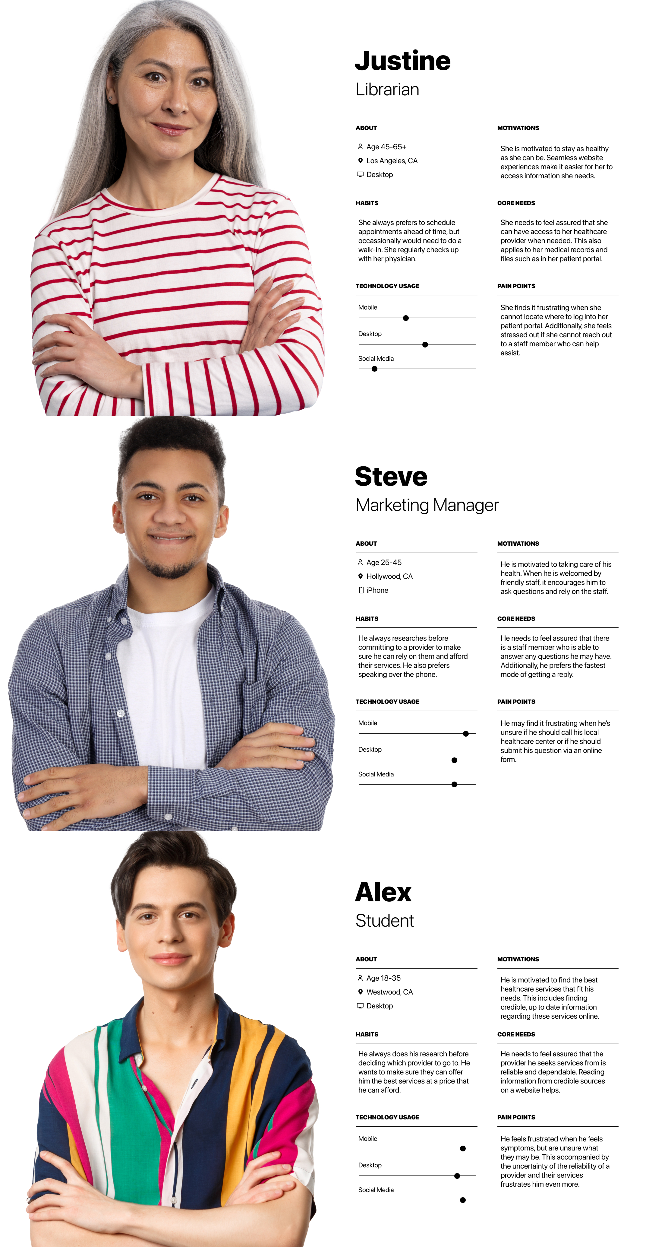
Through the analysis of our database, survey responses, and usability test results, I was able to construct user personas for current patients, prospective patients, and those seeking information. This allowed me to thoroughly address the distinct needs for each user group.
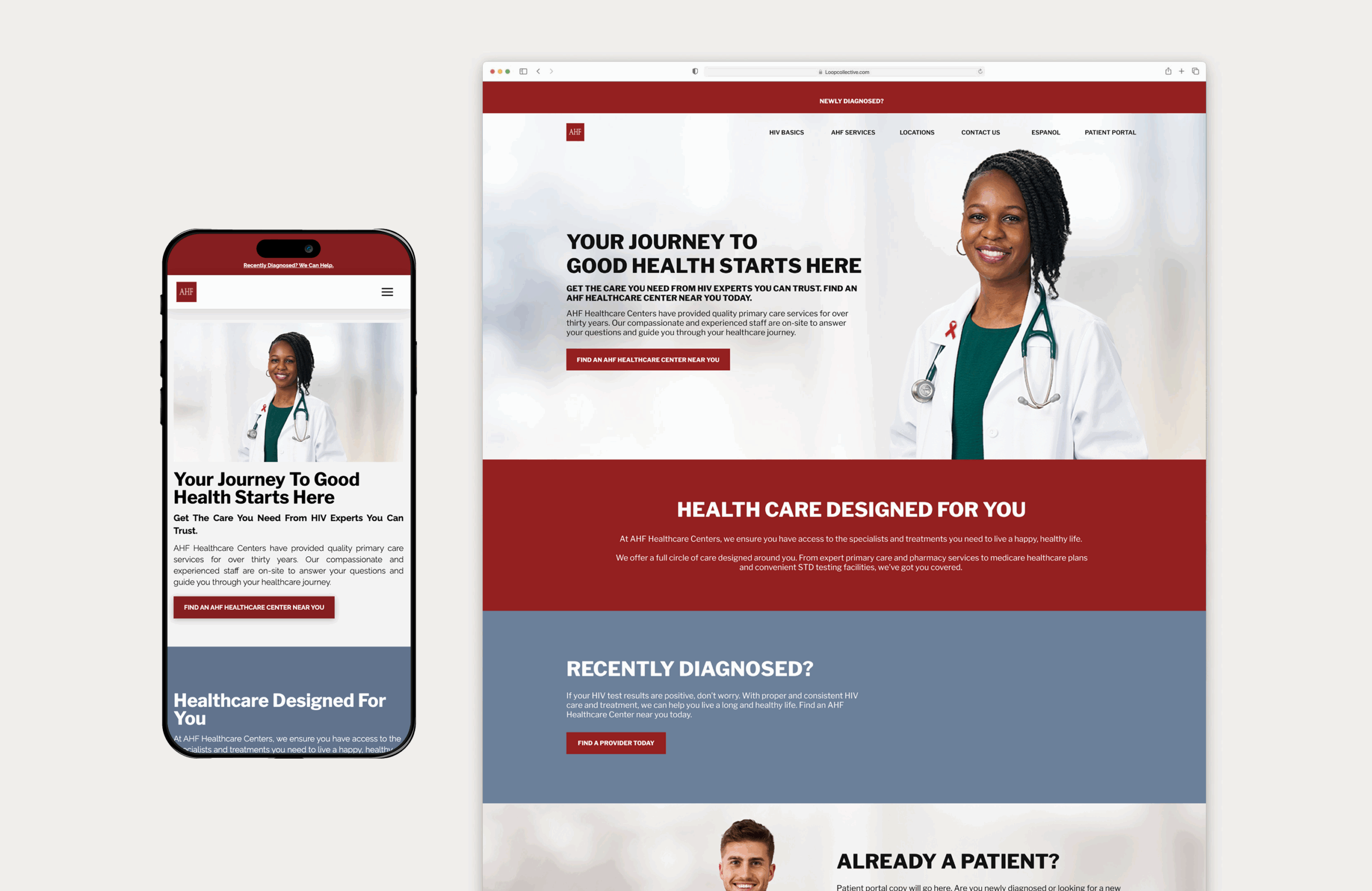
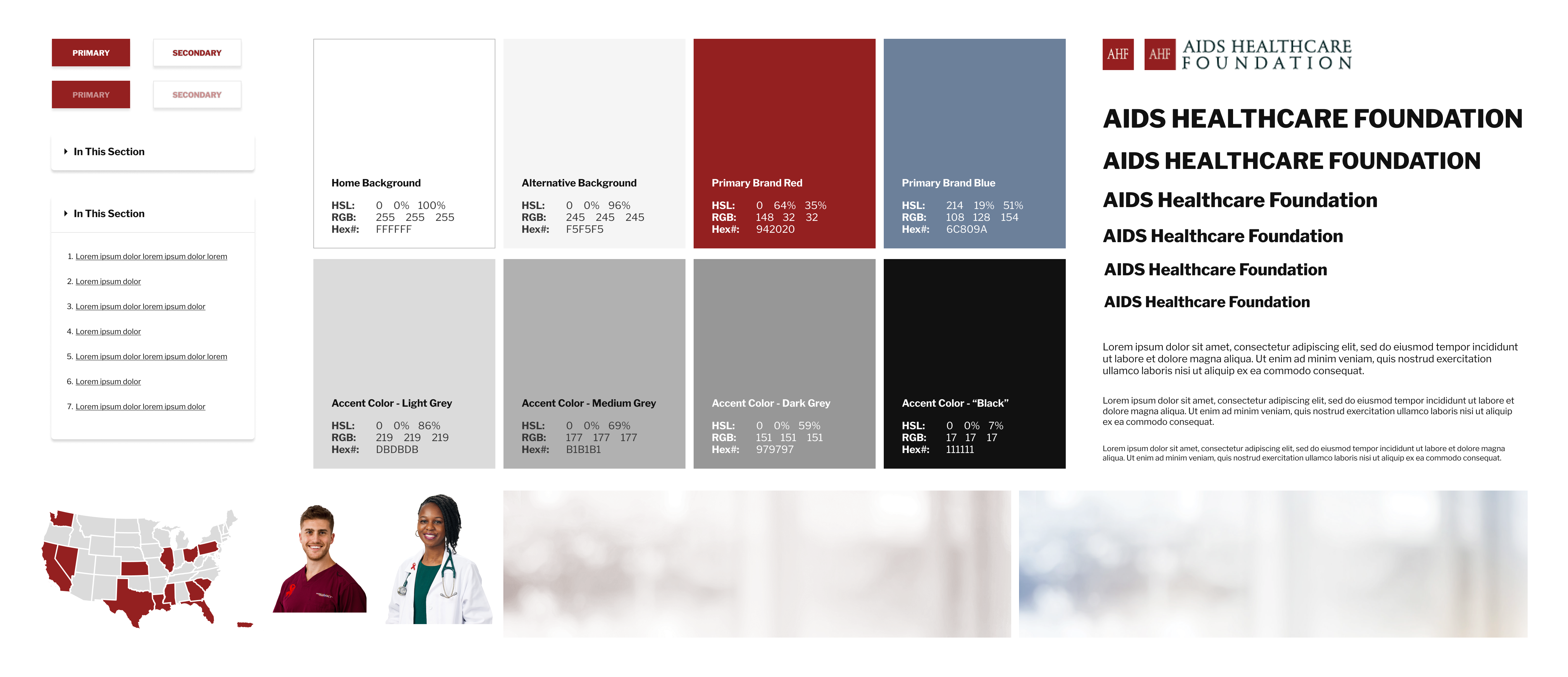
Once the strategy was in place, I collaborated with the design and branding teams to finalize a style guide, unifying the digital presence with in-person experiences. This style guide was the start of consistent branding for the organization's healthcare facilities.
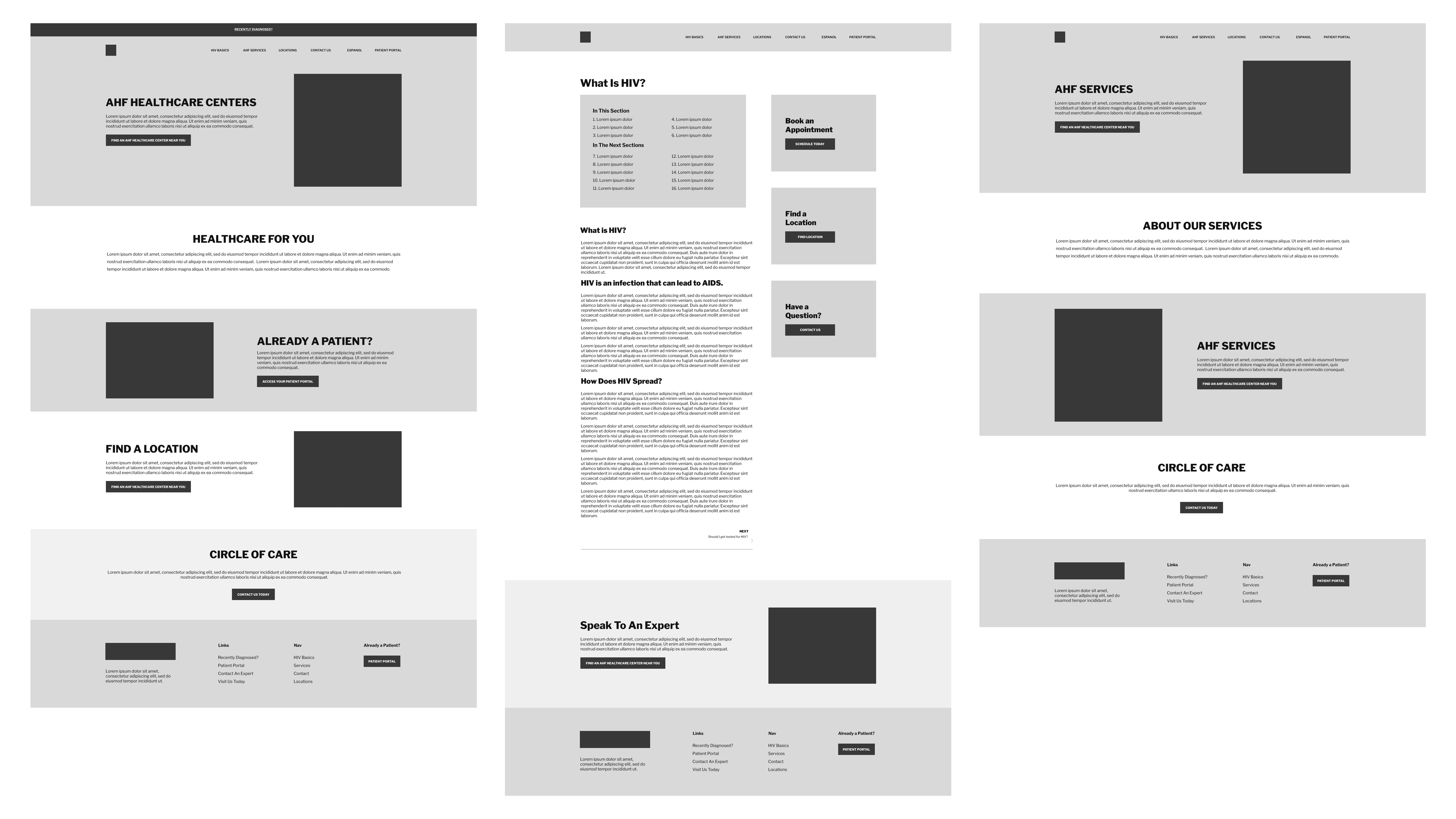
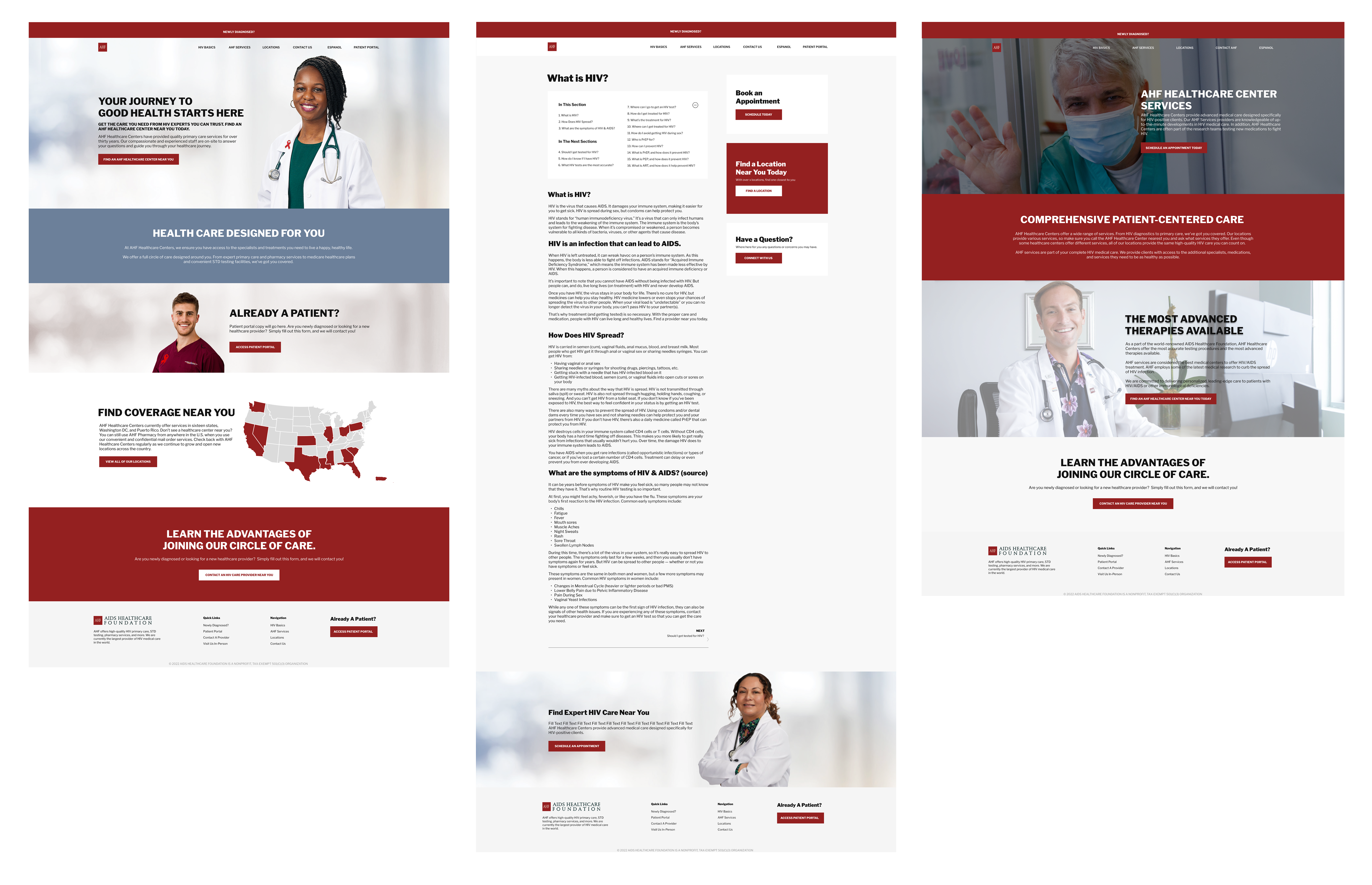
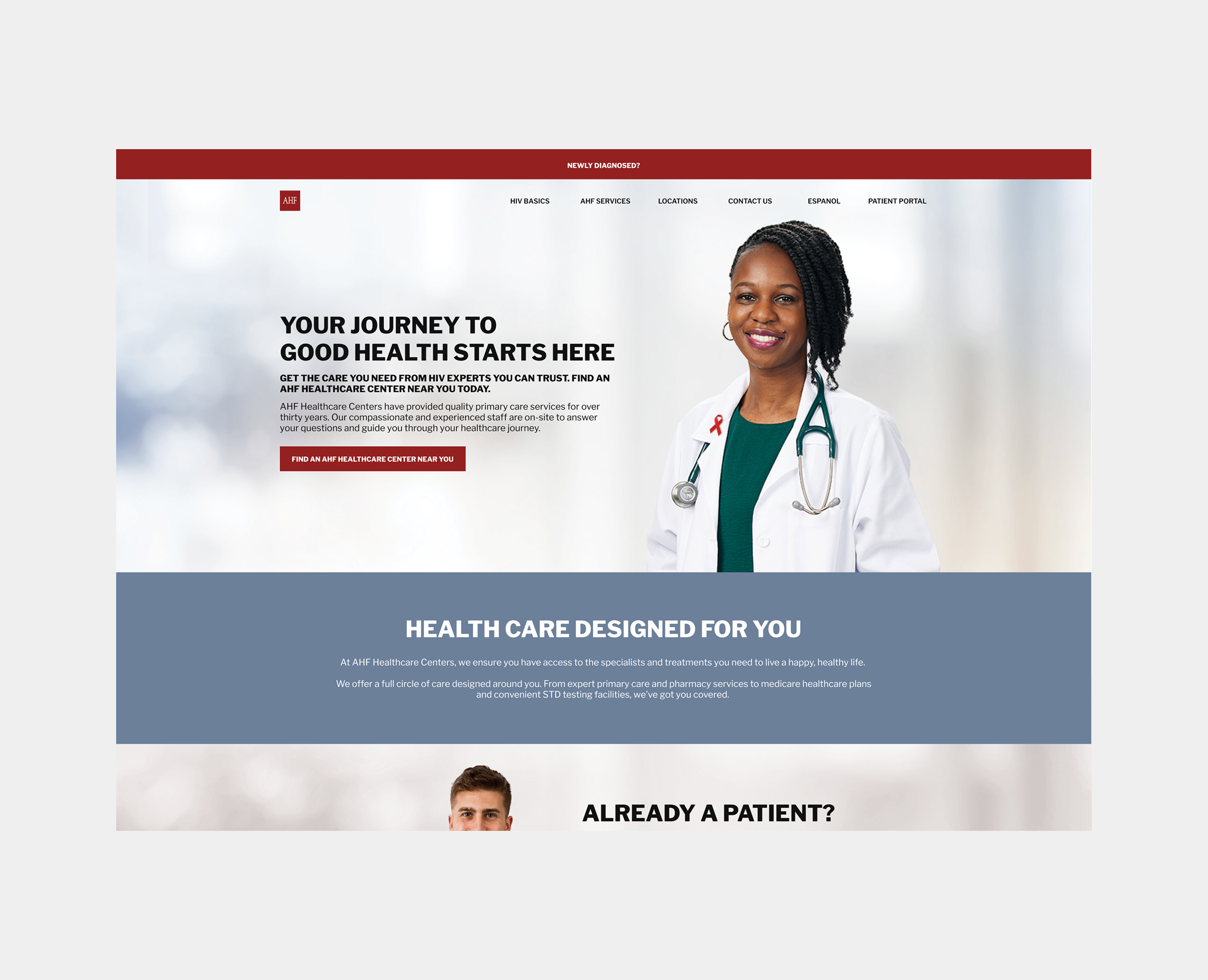
To address usability, I made several changes in the new design including adding the patient portal to the navigation system, repositioning CTAs for newly diagnosed patients, and featuring important links in the footer including internal and external links to critical resources. In addition, we completely restructured the resources pages that held a lot of information ranging from symptoms, how to get tested, treatment options, and more into a table of contents organization to increase readability.


Outcome
After launching the new website, we successfully aligned the patients' in-person and online experiences. (Examples of flyers that patients would see in our healthcare centers are featured above on the right.) With the comprehensive style guide, all design teams (creative, product/web, and branding) have access and direction when creating deliverables.
In regards to website functionality, the new information organization structure showed to relieve pain points and friction, as this was verified through usability testing and surveys. Additionally, we noted a decline in bounce rates, increase in footer usage, and a positive patient experience online and offline.